The New Kidsdata.org: Same Great Data, Easier to Use
With a refreshed look and many new features, kidsdata.org now makes it easier than ever to find and use data about the health and well being of children. Feedback from kidsdata users guided many of the improvements. If you see any early glitches, please let us know. Here’s what’s new:
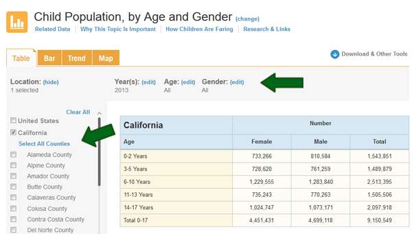
Need to customize your tables, charts and maps by location, year, age, ethnicity or other category?
All locations now are listed next to each graph, so you can immediately select the regions of interest to you. Options for changing the years, demographic groups, etc. also are located right above every graph, so it’s quick and easy to tailor your data display to meet your needs.
Want to view your data in various formats?
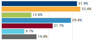
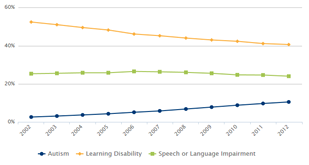
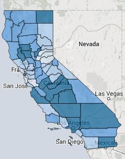
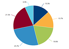
All of our data charting and mapping tools have been significantly enhanced. Click on the images below to check them out:
Bar Graphs:
Trend Graphs:
Maps:
Pie Graphs:
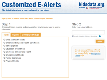
Would you like to receive occasional updates on data that interests you?
Sign up here for our customized E-Alerts.
Interested in being notified about webinars on how to make the most out of the new kidsdata.org?
Send us an email and we’ll add your name to the list.
Have other questions or want to provide feedback about the new kidsdata.org?
Post a question on our “Ask a Data Question” page, contact us at kidsdata@lpfch.org, or see our Help page.
Receive Kidsdata News
New and notable data findings delivered regularly to your inbox.


